When i was looking for a font i wanted a interesting, unique looking one, i didnt want just a plain one so it took quite a while to find some good ones. I didnt find any good ones that i liked on photo shop so i searched the internet and found a website called dafont.com. Below are some fonts that i liked, and had to decide carefully which one would best represent my magazine.


I choose this font because i think it would best represent my magazine, as its edgey as it looks like it belongs on a rock/indie magazine. I like the way it looks like white paint has been splashed over it, and has a little effect of a spiders web. Without this effect it would look plain and simple, and i would not have choosen this font.
Tital ideas
-Nude-Shout
-Sniper
-Rebal
-Youth
-Ban
I have really stuggled to think of a tital that would sound good and that would fit my magazine, and express what my magazine is portraying. The ones that stand out and have potential are Sniper and Rebal. I like Rebal as it does express what my magazine is about, but i think it sounds a bit tacky and not very unique. Sniper is my favourite and i will probably choose this for my tital. When i first heard it i instantly thought that it would suit a rock/indie magazine, as it sounds rebellious and different.
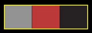
Colour schemes
I have considered many colours for my magazine, but my favourite has to be red, white and black. Black is usally associated with rock and commonly used on rock magazines. The white will contrast well with the black and make it look professional. And red is vibrant and add passion and an edge to my magazine. I would like to use the three colours thoughout my front cover, contents page and double page spread. Thinking back it is similar to Qs edition with Cheryl Cole, its loud yet classy, which is what i want to portray. However i am targeting a younger audiance so i will include elements which will create a modern quirkie fell to it.


I am going to use the girl pictured as my main model for both the front cover and double page spread. I believe she has the perfect style for a rock/indie magazine as she is a follower of this genre. She is a typical example of my target audience. For the photoshoot I have a clear image of what I want Georgia to look like. I imagine her with big, backcombed curled hair, smokey dark eyes and bright red lips contrasting with her pale skin. I also want her to wear a leather jacket and dark clothes to show her rock and edgey side.
Stories
For my main story and model I am going to take a large amount of photos in 3 different locations with to give me a wide variation to choose from.
First location - A plain white wall which will contrast to her black outfit, dark eye makeup and vibrant red lips. These will mainly involve close ups and mid-shots because I think this plain setting will be ideal for the main front cover image.Second location- Back of a garden infront of bushes. I would like to do it when its dark, to make it more mysterious and in the theme of rock. Third location-infront of a green fence. I wanted to add a different colour to my photos, so i decided dark green, i think it goes well and creates an eery and mysterious atmosphere which will tie in well with the rock/indie genre.
For another story i wanted it to be about a girl that has just left her band to start up a solo career. To illustrate this i wanted a mid shot of a rock/indie girl. It is highly important that she looks happy and quite powerful, not sad and vulnerable. I wanted to take the photos inside, to make it look more like a professional photo shoot, with a white wall to contrast with her dark clothes.
My last story was that someone could win a signed guitar. So i wanted a close up of a girl to show her expression more, i wanted her to have a edgey style and a rocky attitude. To create this i would like my model to wear all black which is associated with rock. The model i would like to use has red hair, which will go well with my colour scheme of red. This will add vibrantness to my magazine and to the photo.
No comments:
Post a Comment